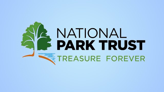
The National Park Trust, a nonprofit organization dedicated to preserving parks today and creating park stewards for tomorrow, has unveiled its updated branding and logo. The unique design highlights the organization’s past achievements and symbolizes the Park Trust’s growth and important mission of protecting the national parks.
Since National Park Trust’s inception, a tree has been the centerpiece of its logo and identity as a conservation organization with a strong focus on acquiring the “missing pieces” of our national parks. Keeping the tree but giving it a meaningful, more inclusive design honors the organization’s past while reflecting its expanded mission that includes a robust national youth and families program. ‘National Park Trust’ was kept in the same font connecting it with the original logo; however, the words ‘Park Trust’ are more emphasized, highlighting the organization’s land trust work, a central focus of the nonprofit.
The bright tree colors represent the organization’s playful youth and family programs as well as the vibrancy of our nation’s parks. The simple and modern logo will reproduce effortlessly across multiple digital and physical platforms.
“Each element of National Park Trust’s new logo has been carefully designed to tell the story of who we are and where we are going as an organization,” said Grace Lee, executive director, National Park Trust. “Our new visual identity better reflects and symbolizes our mission and the work we do to preserve parks for future generations.”
Elements of the new visual identity include:
- The Tree – The tree illustrates strength, growth and stability and is designed to reference the different plant and animal species found in parks. It represents elements of diversity. Two different shades of green signify old and new growth, bridging older and younger generations and linking the past with the future. The branches are defined, smooth and curved to flow from different directions merging to come together symbolically as one. The tree also represents strong roots, inclusiveness and the importance of being welcoming, valuing and respecting our differences, and connecting with people from a range of communities.
- The Land – As the literal foundation for the tree, the land element is represented with a rounded curve. The curved design represents the rolling hills throughout our nation. The warm brown color reflects the soil needed to nurture the many ecosystems in our environment.
- The Water – Oceans, lakes and rivers are the lifeblood of our environment. This element is represented with a bright blue that interfaces with the tree and land elements, just as it does in our parks. The shape is fluid, with light-reflecting onto the water.
- The Wordmark – “National Park Trust” was kept in the same font and similar format to connect with the original logo. “National” is less emphasized with more prominence on “Park Trust,” referring to the organization’s historical focus as a land trust. The organization’s name is printed in black for easy readability; however, the tagline, “Treasure Forever,” is accentuated in a fresh green hue to separate it from the organization’s name and to highlight the Park Trust’s accomplishments will be treasured forever.
Overall, the logo represents the Park Trust’s updated and relevant mission. Each element of the new logo has been designed to tell the story of the Park Trust and its continued evolution, growth and impact.


